Wednesday, February 21, 2007

Q and A


okay, somebody asked me... Dallas, why are you doing these toon shaders? what kind of "Look" are you going for? Well, that's a two part question. First I'm doing them because everyone needs a hobby and I enjoy working on them and 2 because alot of normal toon shaders feel so limited that I wanted to create my own system.

Second, What "Look" am i going for? Well, in general i don't have a specific "look" in mind just a process for doing any look I want in the future. However, I do look at 2d image examples when working. I think This Wolverine pic is the best example if what i think i can do with this system as it currently stands. you need a lot more layers to get that wolvie pic but it is doable.

Tuesday, February 20, 2007

I had a three day weekend so what did I do?... Clean out my closet!


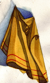
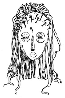
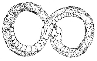
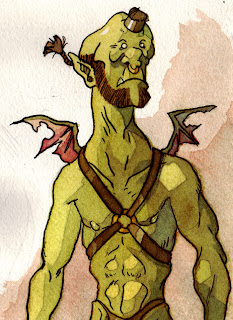
Oh yeah! i'm such a man of excitement! give me a three day weekend and i clean out my closet. No seriously, it really needed to be done. I had stuff dumped in there that was 5 or 6 years old. Naturually, I found shit loads of old doodles. Many of which deserved to be stuffed in the closet. :-P So the ones I'm posting here are some of the more intresting ones.

(OH! and Justin, I'm not being 'negitive' :-D )

Hmmm, In other news I modified the blend shapes on Bunny so they work better. (for those not in the know, 'Bunny' was the animated rabbit I made in maya about 2 years ago. Ever since I've been hired at High Impact I've been going back here and there to redo parts of him as my knowledge grows larger). The only thing left really is to edit his smile shapes. All my blend shapes in general needed to be pushed way further.

Once I finish those blend shapes (which should be tonight actually) I'll gut his rig and re rig him from scratch. This will take me a little while (since rigging isn't my first love) but it needs to be done. Looking back bunny has ALOT of rigging mistakes.

Hmmm, what else... I made some minor tweaks to the toonshader method. It seems to work a little better now. For what it's worth I'm done with the toonshade. It pretty much does exactly what i want it to do. I've already started writting up the process into a formal document so I don't forget how I did this.

Okay, that does it for me. Let me post these doodles and strat to do some real work. :-)

Monday, February 12, 2007

My old hallway study.


I totally forgot i did this! this was a lighting study i did in maya for a hallway. I was inspired by this tutorial on 3dTotal. I kept it to one texture because i wanted to focus on the lighting aspect first. I have this idea that the pipeline for 3d might be better if it mimics the learning process for most traditional art. You learn to draw/paint in monochrome before color so I wondered. "What if i light my subject first and THEN make textures for it?" how would that turn out?

Well, I'm actually really pleased with how the lighting came out on this one. so for the second half I'll make better textures to go with it.

Friday, February 09, 2007

Getting over sickness and other toon shading stuff.

Ugh, Today I'm getting over a cold or flu or something. I dunno what it is but this headache is getting on my nerves. Well, on to bright side. Just 30 minutes ago i did a quick test to make sure my toon shader worked with the black and white images needed to put noise along the edges. OH! And before i forget I actually got a reply back from one of the people who worked on “Fairy Berry” I believe it was the rigger. Anyway, she told me her process. I understand it in theory I just don't know how to set up a shader network to do it. Sigh, I'm always amazed by how much I don't know it's really is frustrating.

Anyway, her is what she said.


want some tricks from the author directly?

i use 2 ways to get noise in cell shading
first is to remap a bumped white lambert. it works nice, but when mesh is deformed or animated you can guess this is bump
second is to use some algebra to blend light and noise like fusion mode in photoshop. the shaders in fairy berry use something like the linear light of photoshop to blend a paint map and a surface luminance info, then i remap this output with a clever ramp

that's all. after that you have to choose some nice colors and there it is!

btw maybe you could post some of your outputs. i'm curious now!


Heh, I hope i don't disappoint when i post. My method is totally ghetto compared to this way.


Hmmm, anything else.... Well, now that I know this method works I wanted to try another method that is based somewhat off of the basics of photoshop paintings. This system actually uses a series of shadow layers that are just multiplied over each other at 100, 50, and 25% opacity. This mimics somewhat the “Dodge/Burn” process that photoshop painters seem to like so much.

Tuesday, February 06, 2007

New Toonshade test.


So, i finally finished my first good toonshade test using my new system. I got frustrated using the surface lumanice/ramp method because. 1) I couldn't make my gradent from light to dark uneven without a lot of annoying edits and 2.) I couldn't control the gradent in post. So, this method basically use the Luma Matte option in after effects to sort between two diffrent images via a black and whit image. the end result is the same as a normal toon shader but you can control the gradent in post with "Levels".

On top of that I also addes an Ambient Occlusion map and Specularity. The end result is a but mixed. I like the back part of this pot the best it seems to have the most natural gradient while looking somewhat flat. On the light side the color contrast is to sharp but at least the gradient from light to dark is uneven, just the way I wanted it.

all and all I would say that this was a good test. I know my system is working I just need to do alot of tweeking to get the results i want. Though I'm still on the fence about how "3d" versus "2d" i want this to feel. Oh well.

Thursday, February 01, 2007

Dallas and Toon Shaders


Okay, If anybody knows me I'm a nut for NPS (Non Photo realostic Shading) in 3d art. I think this mostly come from my Illustration background before I made the shift over to 3d and photoshop and the like. Most CG work out there tries very hard to mimic real life and I have to admit they have some VERY impressive results. But it always bothered me that 3d work never seemed to have the same emotional impact visually as the hand made work for say a disney 2d feature.

Then I discovered Toon shaders! with a few simple little connections you can get a look that looks 2d but still keps it's 3d volume when rendering! Here i'm just gonna post a simple toon shader network. Alot of what i make is based off of this template.